How might we create effective, reusable solutions to common user problems?
The Design System aims to unite websites, cloud products, and apps. It consists of design components with guidelines on how best to use them.
Sage GmbH
Role: Qualitative and Quantitative Research, User Journey Analysis, Conception, Design, User Testing, Stakeholder Workshops
Research Lead for Germany, Project Lead and Final Design Handoff for In-Product Messaging (1 of 4 components developed): Documentation and detailed Behaviour of the component, Categorization of Notifications, Reusable Design (Master) Sketch File for the Sage Design System
Problem Area and Goal
1. Lack of a cohesive design system led to inconsistencies in the functionalities, workflows and behaviour of various Sage Products
2. Weak user experience of learning to use new and changing tools.
With a varied landspace of local websites, apps, products and services in different countries and region, we had the challenge to bring all global products, services and ecosystem under one seamless and consistent Sage experience.
The Design System prevents random inconsistencies within and between products and speeds up design and development process. It also lays down guidelines that help making products accessible according Web Content Accessibility Guidelines.
Working of the Design System
The Sage Design System comprises of Reusable patterns which are built with components. In turn, patterns combine to become precisely engineered end-to-end journeys - effective solutions, as well as delightful experiences. This ‘atomic’ approach speeds up design and development, and avoids re-work later.
Contribution to the Sage Design System was a hugely collaborative effort with the entire global experience design team working closely together.
On this page I have listed the various components I was a part of, through research and/or design.
1. Carousel
A result of the research and testing on this project, the Carousel became a part of the Sage Design System, made available for all teams to use.
A carousel enables the user to cycle through visual content items using the same space. They can be used to good effect to introduce new product features to existing customers after an update, or to walk new customers through key features. Visuals include videos, gifs or images.
Role: Concept, visual and interaction design support
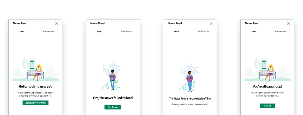
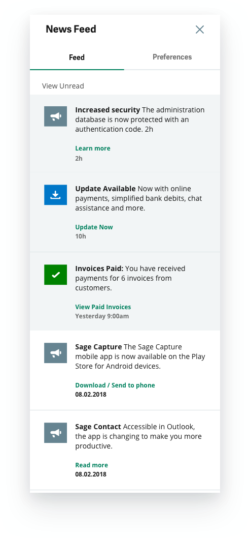
2. Discovery Sidebar
I led the design for the discovery sidebar and documented the design to be a part of the Sage Design System, made available for all teams to use.
The newsfeed sidebar is used within products to present the user with both internally and externally triggered product notifications and news. Notifications could be trigged by either the actions of self/ another user of the system while the news is triggered by admin, i.e. Sage.
The bell icon has an omnipresent location within desktop and cloud products. A dot ("what's new badge" described below) notifies the user of something new.
Examples of internally triggered notifications include:
- approvals, requests, reminders, key completed tasks, comments, onboarding related tasks, to-dos etc.
Examples of externally triggered news include:
- product announcements, new features, product updates, tips and tricks, important tax and legal changes, critical bug fixes, surveys etc.
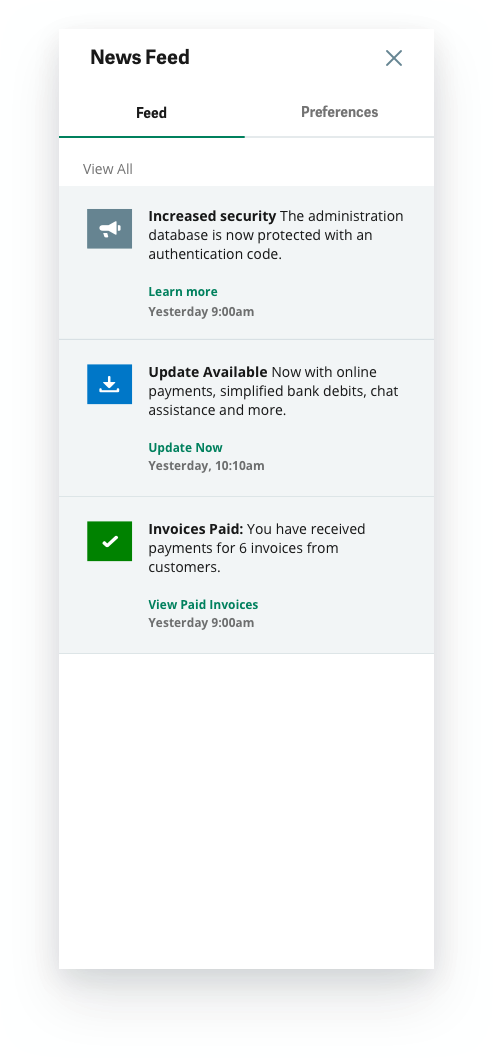
Status and Behaviours
Read/Unread - View unread and view all act as switches for the content. Keeping the log of news, but offering a focused uncluttered version of unread news.
Marked as read - Posts are marked as read after 10 seconds (example, twitter).
Deleting - No way to delete posts directly in the feed in v1.
Expiration - Notifications older than 3 weeks disappear from the feed. News older than 3 months expire.
Icons and Colors - The icons and background colors help convey the urgency and category of information.
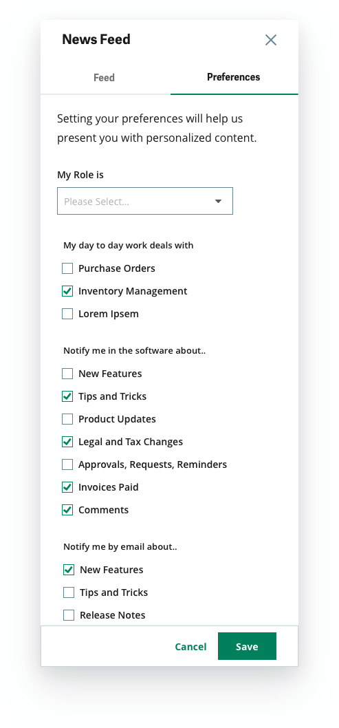
Preferences and Settings
The preferences tab helps deliver tailored content to the user. The user knows where to actively seek and adjust the content he receives, and chooses what to receive in the product and via email.
Here, the user can set roles, frequent tasks and preferences to receive personalised updates based on his/her role, and daily work areas, we can deliver relevant updates and content - for example, knowledge of a new feature that facilitates his work and saves time followed by a step by step tutorial/ walk through/ tasks.
We have 5 background colors available to denote the priority of notifications. These help the user to quickly grasp urgent, important information.

3. What's new badge
A result of the research and testing on this project, the What's new badge became a part of the Sage Design System, made available for all teams to use.
The Badge lends a clear indicator to show users when and where a new feature has been introduced. The what's new badge is a gold circle that aids discovery of new features. Gold badges are used to trigger contextual pop-ups or in-product messaging.
Role: Concept, visual and interaction design support
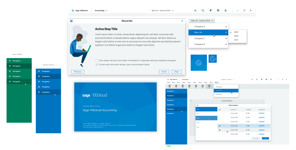
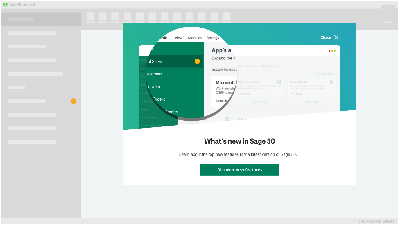
4. Patterns for Desktop Products
Parallel to and based on the design for cloud/web products, we created options and guidelines for desktop products. The concept, visual and interaction design took into account technological differences and limitations.
The patterns we developed:
Application header
Application Interface
Navigation Options
Splash Screens
Wizards (Long Linear Step-by-step process
Foundations set:
Fonts
Colors
App Icons