How might we redesign the employee section of a HR payroll software, with a focus on enabling users to save time on repeated tasks, offer a better first time use experience and make their workflow smoother?
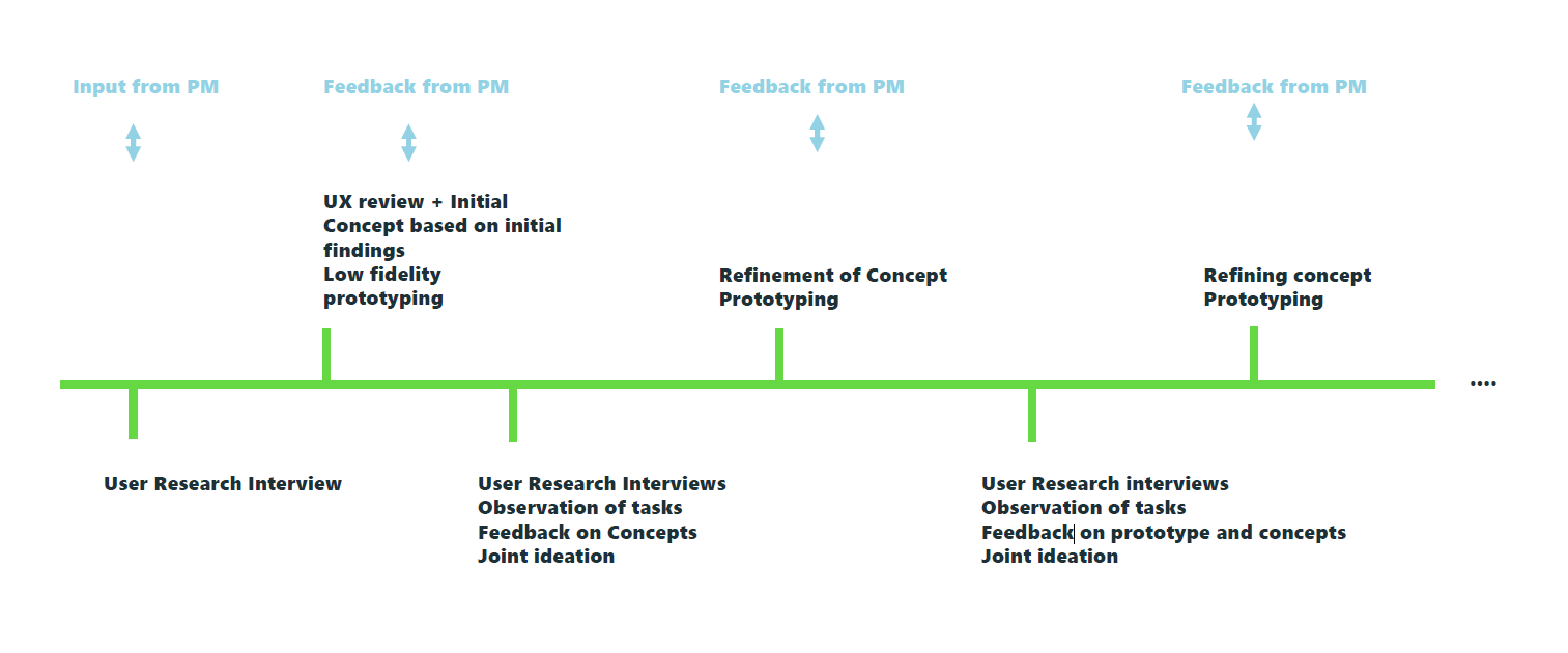
The Sage HR Suite is moving towards being a cloud product and is undergoing a complete redesign. The work started with the redesign of entire payroll module. We started with a UX review, and exploratory UX research to lay the groundwork for a new concept. Regular UX research and testing validated the concept the direction of the redesign.
Sage GmbH
Role: Lead Researcher and Designer, Qualitative and Quantitative Research, User Journey Analysis, Conception, Prototying, UI Design, User Testing, Stakeholder Workshops, Contribution to the Product Roadmap
Project Scope
The scope of the project involved:
- an entire rework of content, structure, workflows
- rework of Information Architecture,Interaction Design, Navigation, UI
- analyzing all the content in detail. Removing redundant content, and optimizing data entry
Problem Analysis
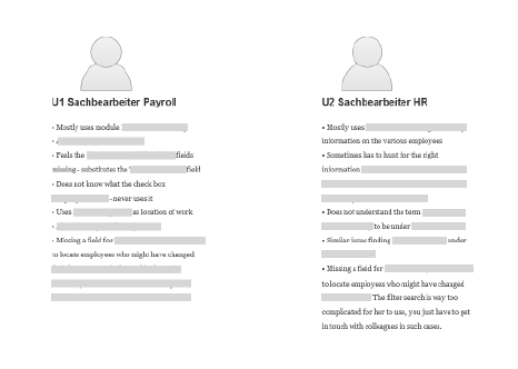
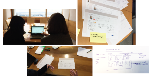
Since there was no design research done on this project before, we started with an exploratory research, learning about the software from the users that used it the most. This way we got a deep understanding of the issues faced by the users, an understanding of their everyday work, and how they experienced the software.
This gave us a great starting point, along with conducting a UX review, which pointed out to more outwardly UX problem areas based on best practices.
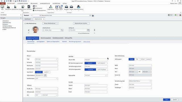
Information Architecture
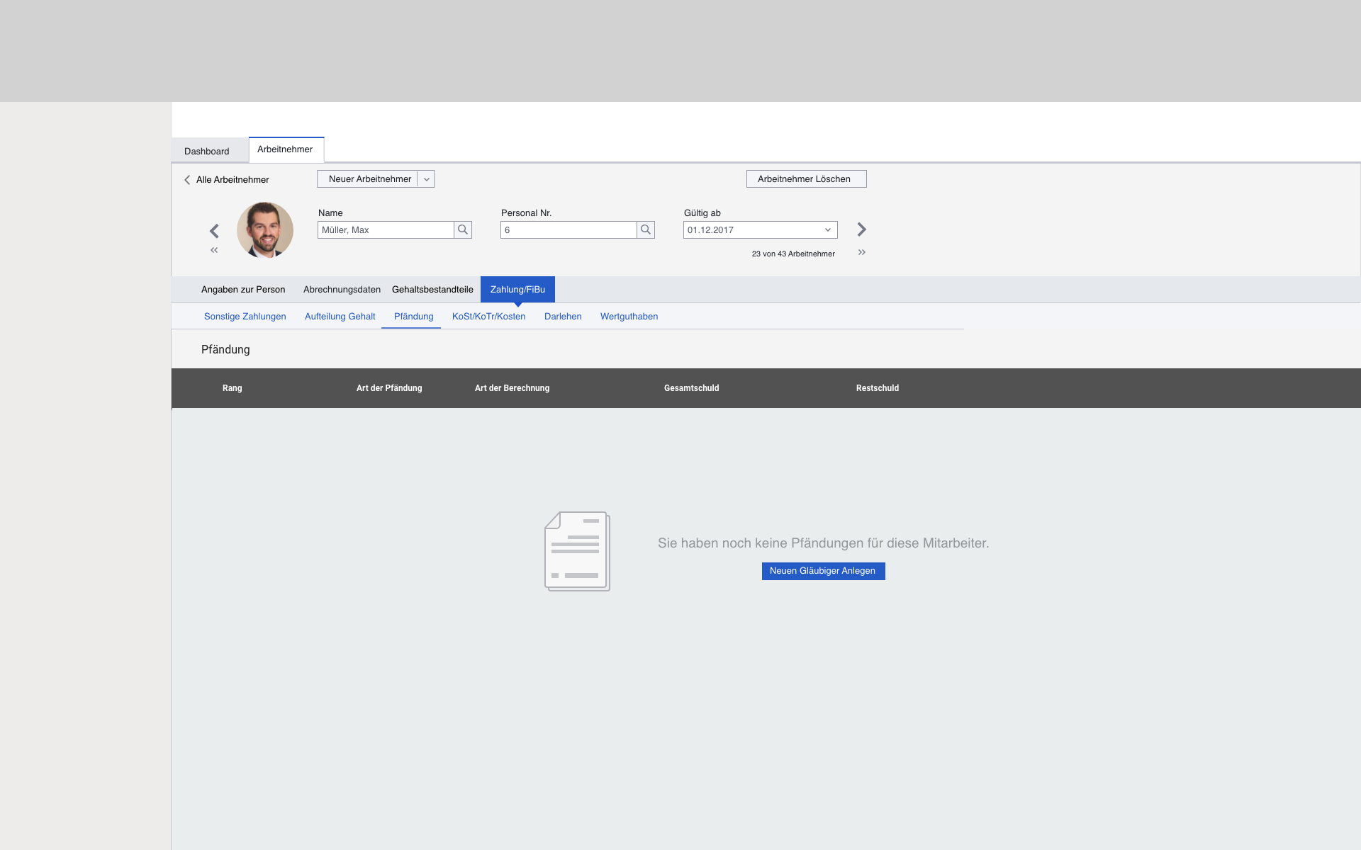
One of the main insights we had during our research phases was the findability of information, unclear headings, unclear error messages, confusion and uncertainty about the categories, missing fields, and not knowing what a lot of the fields or checkboxes were for. Most users learnt to use the software at the beginning and always carried out the same steps thereafter.
"The software has too many possibilities"
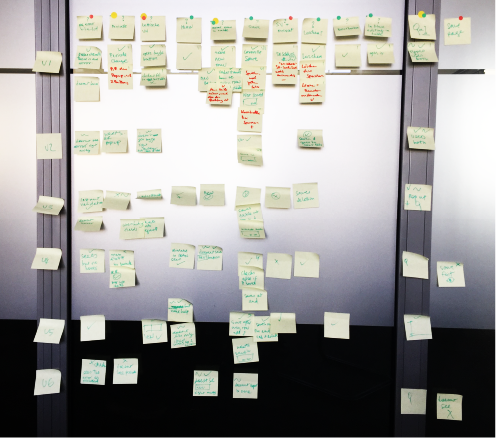
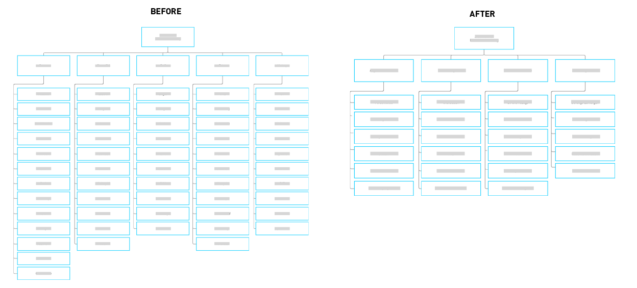
One of the first things we did was to completely restructure the information architecture, working on the wordings, UX writing and categorization which would be more intuitive and easy to understand for any user regardless of prior experience.
We drastically reduced the number of clicks needed to get to information, and the number of pages. We clubbed together relevant information, working closely with users.
We tested the new Information Architecture with users and iterated it continuously.
Most time consuming User Flows
We recognized with the help of users, the main user flows and the ones that were the most frequent and took the most amount of time. We then worked on ways to optimise this experience.
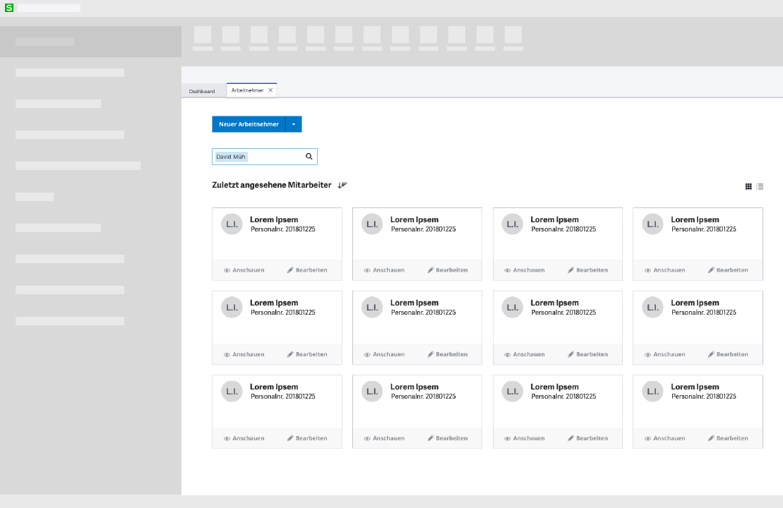
We added a dashboard, which enabled various user roles to take up differentiated user flows created specifically for them. Addtionally, we added a template option to make the process of adding a new employee much faster.
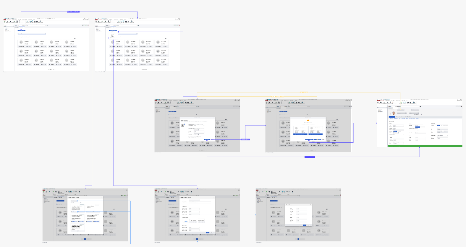
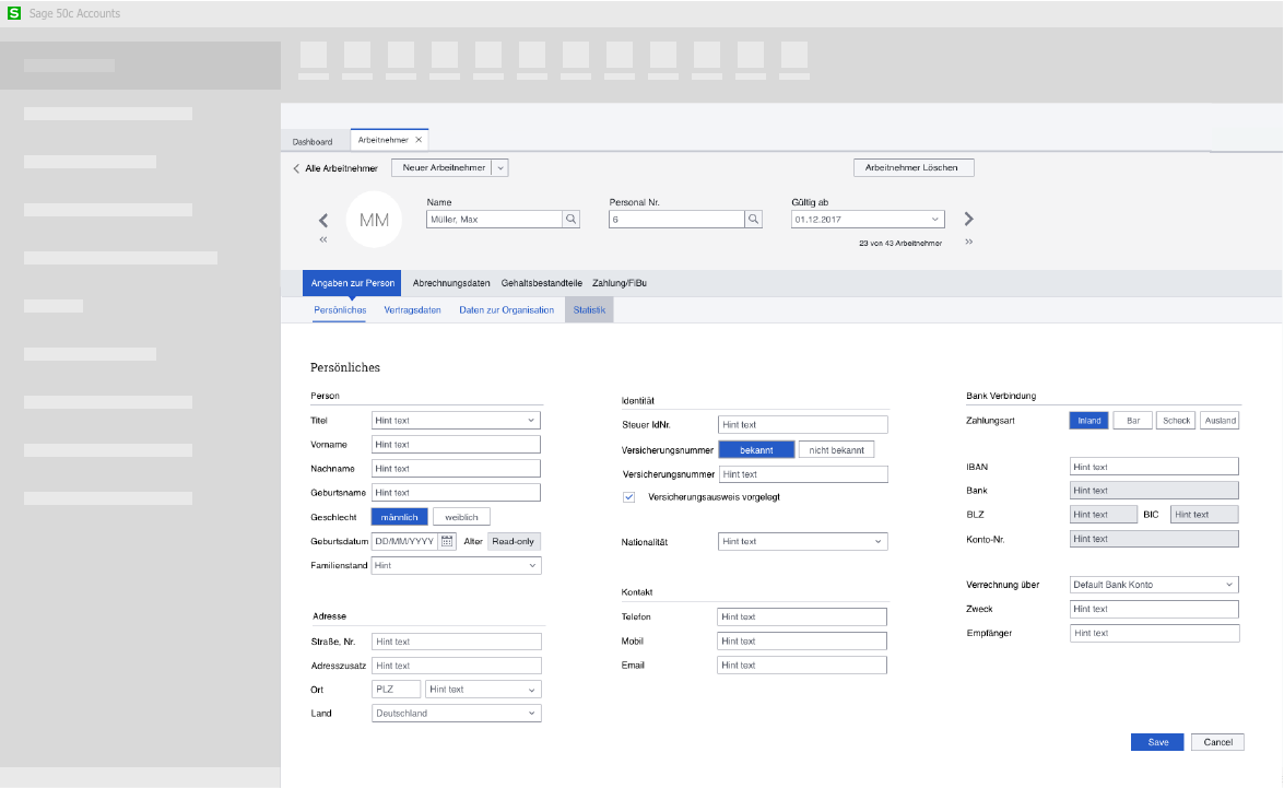
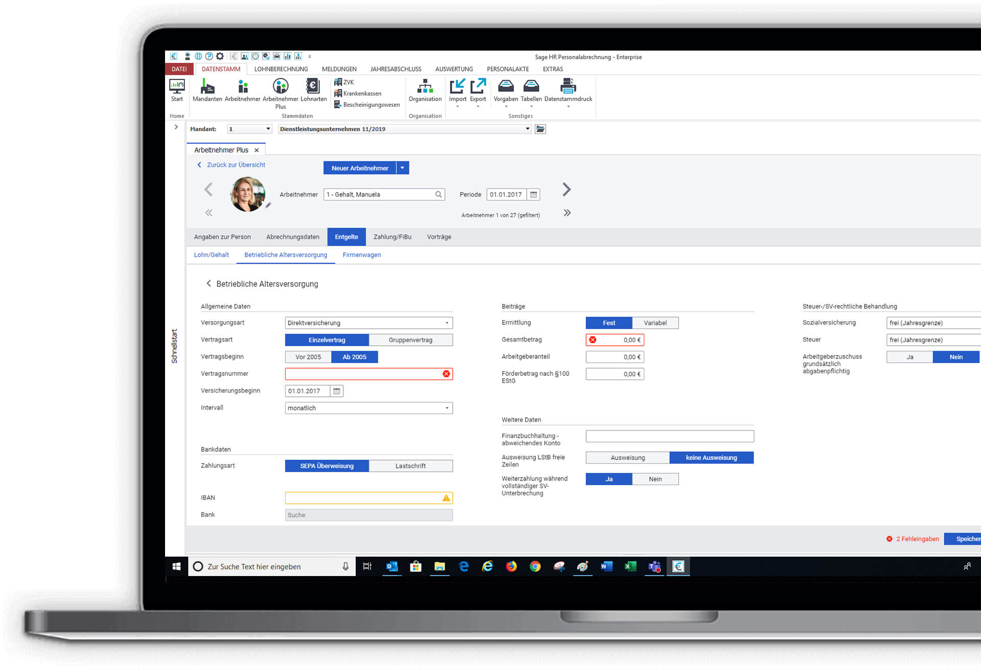
Create a New Employee
One of the most time consuming, frequent tasks was completely restructured to be intuitive and easy to use.
As a result, users felt "things were much more together". In-Field Validation, helpful error feedback and tips, a new saving functionality were some of the features added.
Other Areas of the Software
User Pain Points Addressed
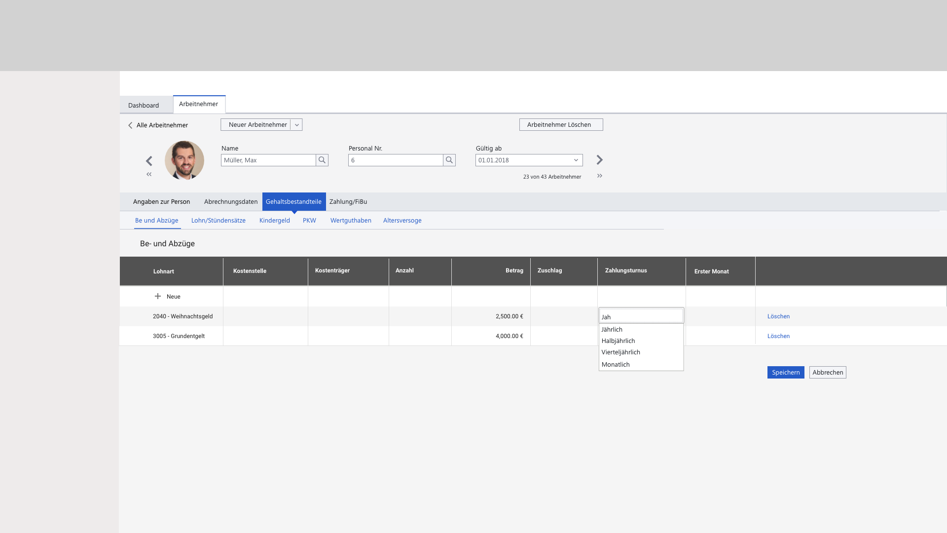
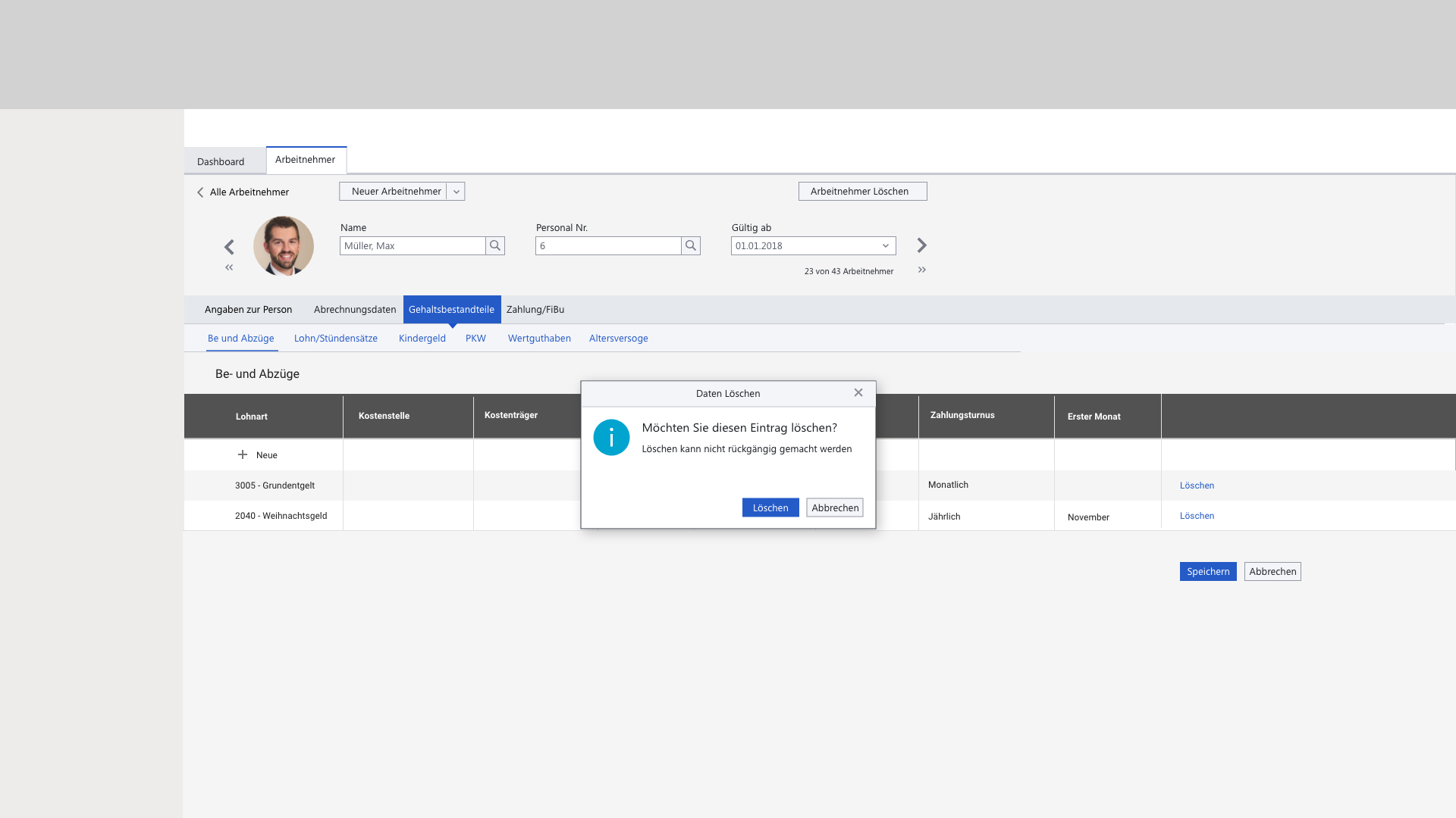
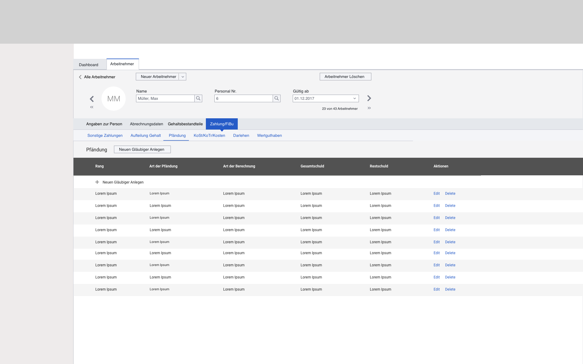
- Reduction in the number of clicks for data entry
- Save Functionality and safeguard against mistake savings
- Intuitive Search and dropdowns generated through text input
- Showing only relevant fields, smarter data entry
- Immediate feedback to users after data entry
- Clear Display of Information and better Screen Usage
The new concept generated a System Usability Scale (SUS) Score of 83.